Spendly-Expense Tracking App
A personal project that is currently being developed
Project Overview
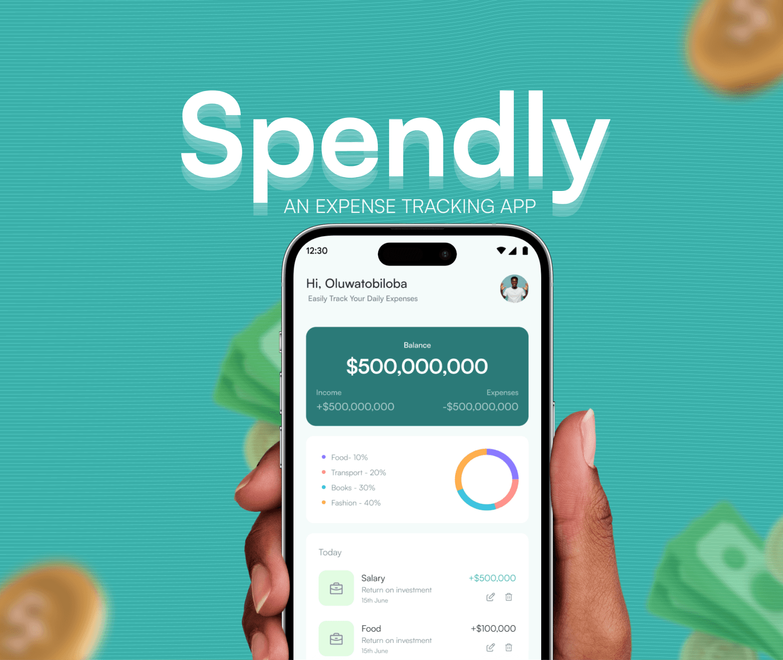
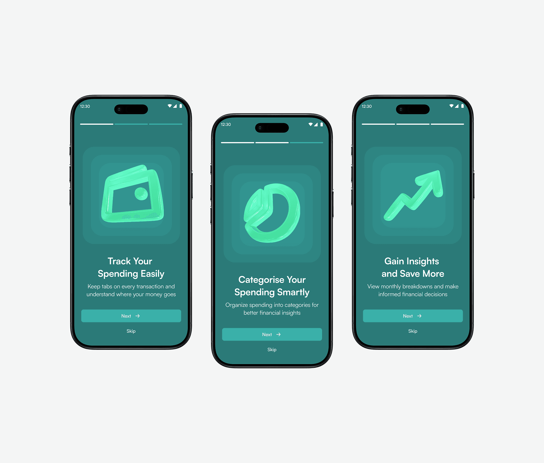
Spendly is a mobile application designed to help users track their daily expenses and gain better control over their finances. The project focused on creating a clear and easy-to-use experience that encourages consistency without overwhelming users with unnecessary details.
The Problem
Many people struggle to track their expenses regularly. Existing expense tracking apps often feel complex, require too many steps, or present information in a way that is hard to understand. As a result, users abandon these apps after a short period and continue spending without clear financial awareness.
Project Goal
I reviewed common expense tracking apps and user feedback to understand why users struggle to stay consistent. A recurring issue was that many apps prioritised advanced features over basic usability. Users cared more about speed, clarity, and minimal effort than detailed financial reports.
Design Process
Research and Insights
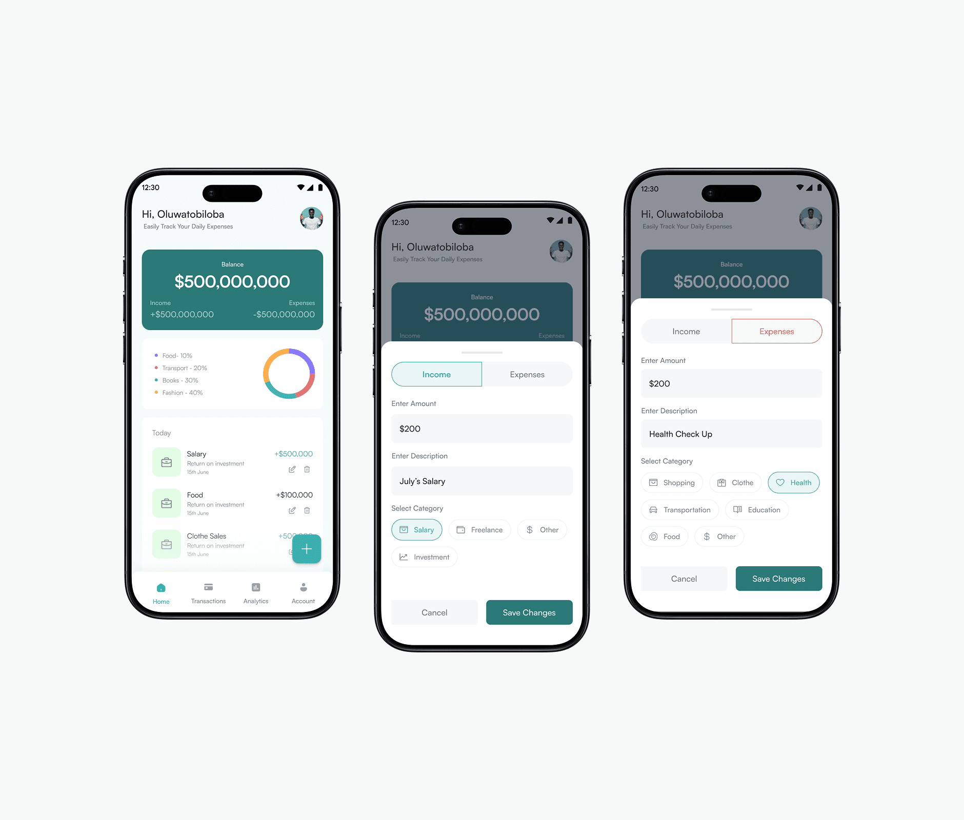
The user flow was designed to reduce friction, especially for the most frequent action, adding an expense. Core actions were prioritised on the home screen to limit unnecessary navigation and decision-making.
User Flow
The user flow was designed to reduce friction, especially for the most frequent action, adding an expense. Core actions were prioritised on the home screen to limit unnecessary navigation and decision-making.
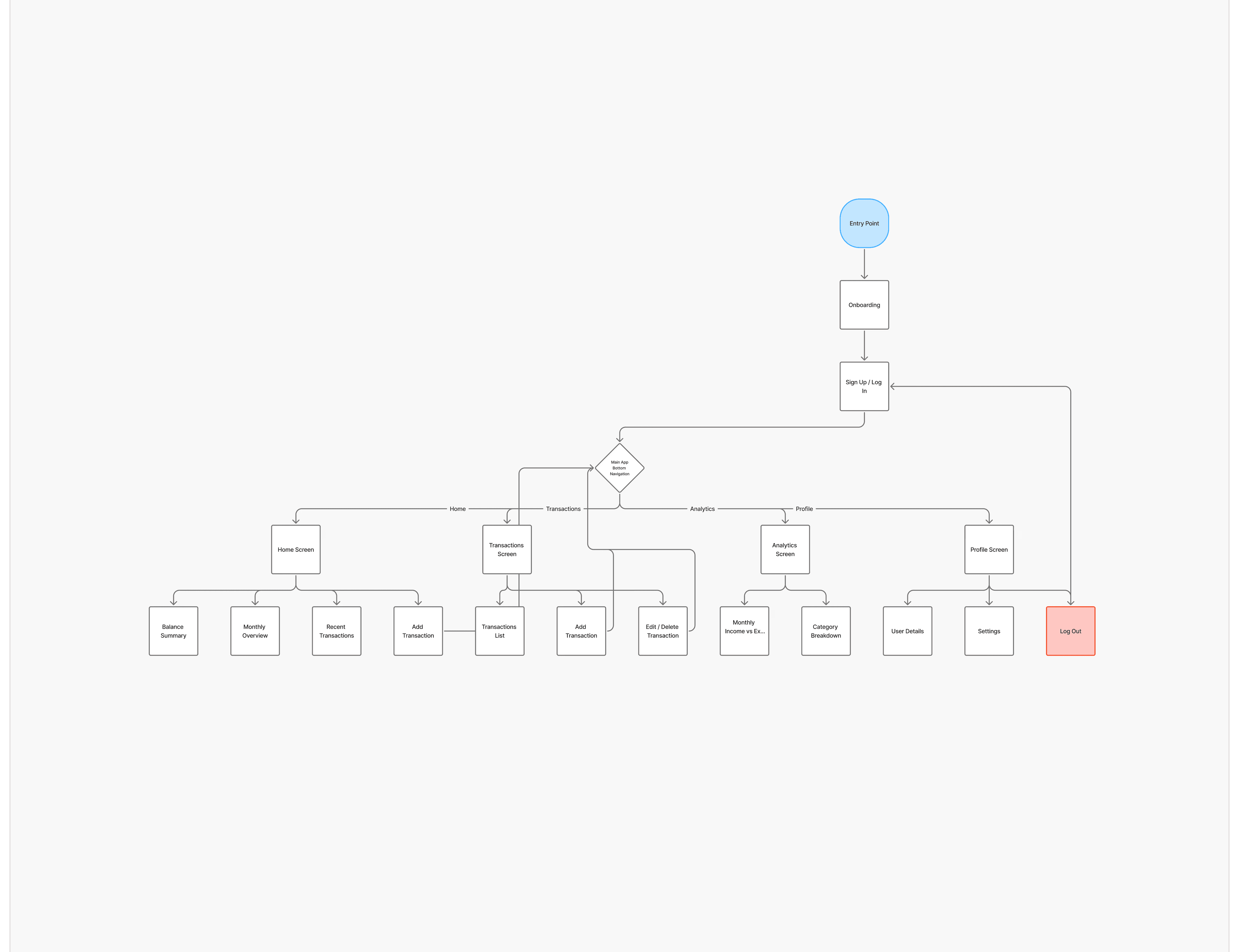
Key Design Decisions
Expense entry was placed prominently to encourage frequent use
Spending summaries were visualised to improve quick understanding
Categories were kept minimal to reduce cognitive load
The interface was designed with clear spacing and hierarchy to improve readability
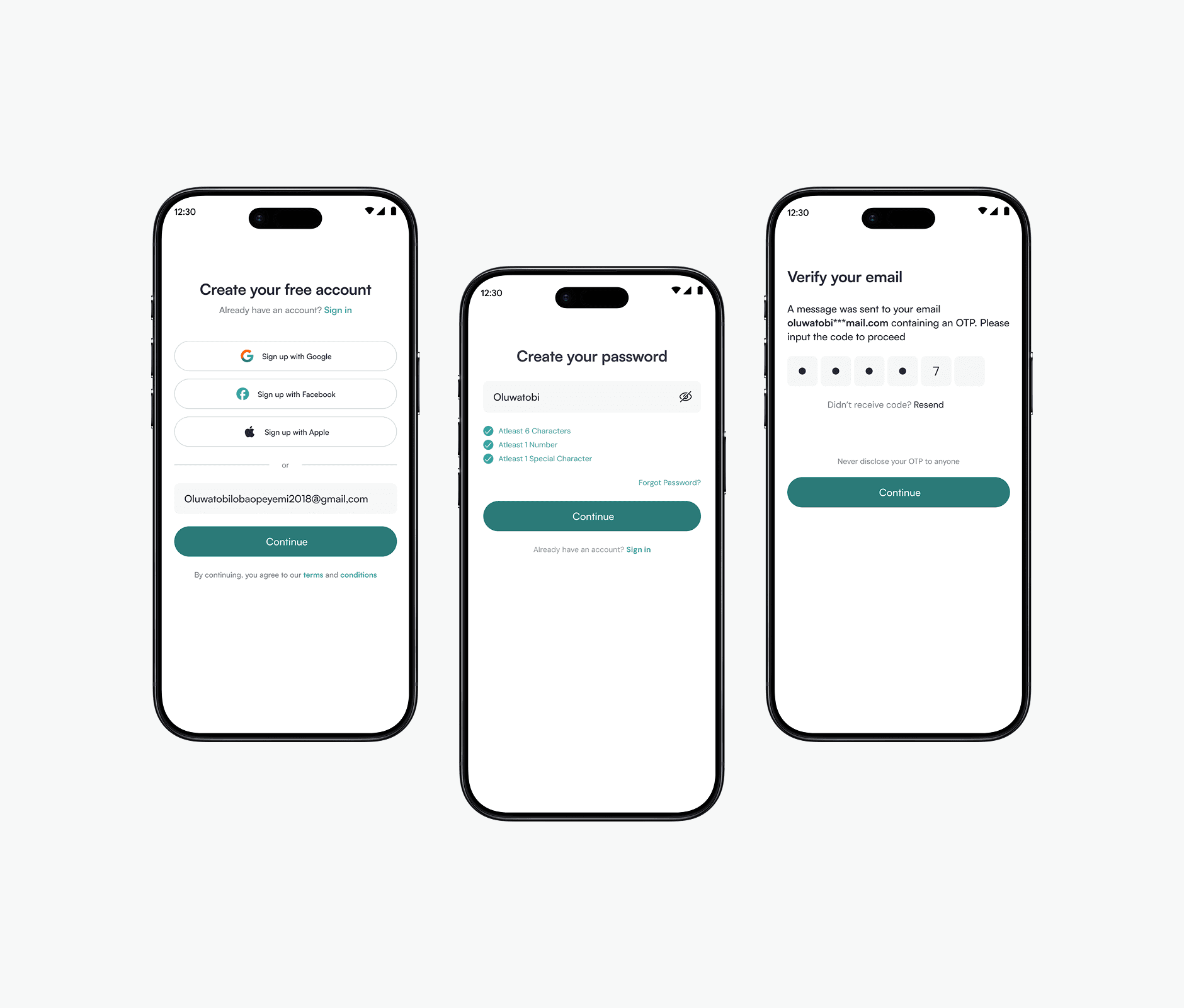
The Solution
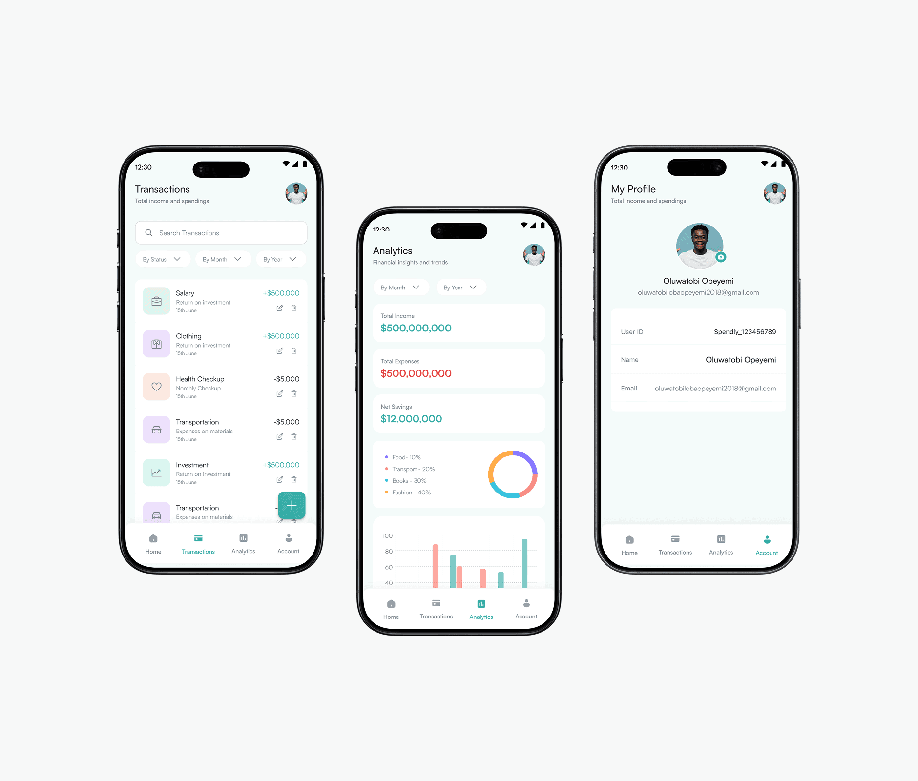
The final design presents a clean and structured mobile experience that allows users to:
Log expenses in a few simple steps
View daily and monthly spending summaries
Understand spending patterns without complex charts or reports
The focus remained on practicality and ease of use.